With the start of a new year, businesses reach a pivotal juncture. The advent of sophisticated computing platforms has simplified data collection and processing. So, you must know how to make the most of that data and what to evaluate are now pressing issues.
Introduction
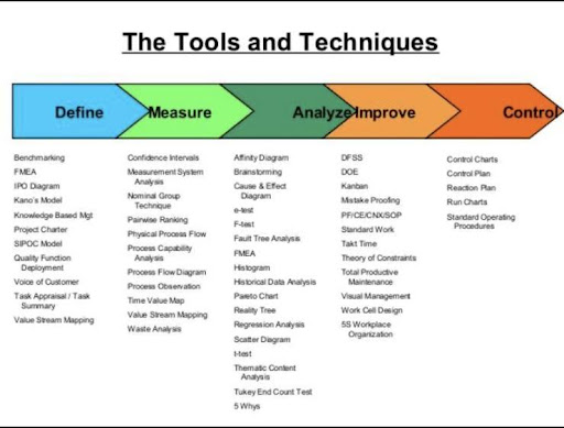
Six Sigma is a business approach and data-driven process to deliver nearly-perfect products for customers, lowering the rate of defective products to 3.4 defective parts per million, equivalent to producing products with a defect-free rate of 99.99966%. It is a vital part of any business process improvement because it significantly boosts the efficiency of the company by identifying flaws & weaknesses in the processes. This is why it is a vital part of any business process improvement. Over the course of many years, practitioners of Six Sigma have developed a collection of tools and procedures that address control & problem-solving to achieve their goals of bringing about improvements to remove defects and waste.
This is where Lean Six Sigma comes in handy. Whether a company is a retailer wanting to optimize a digital marketing campaign or a manufacturing company looking to increase yield rates & enhance quality on the shop floor. It also helps merge the continuous improvement of processes with the power of modern data analytics, presenting an opportunity to improve operations.
Having the correct personnel on staff who have been educated in Lean Six Sigma approaches is crucial to achieving desired results.
What Is Six Sigma?
Project teams do an in-depth analysis of the process’s output and input variables when they are in the Analyze phase of the Six Sigma DMAIC process. The outcome of this data analysis should be an improvement in how business processes are carried out, as well as a reduction in the number of possible inputs found during the Measure stage. To carry out the analysis, various tools are utilized. These tools assist in the identification of a few possible problems & drive process optimization, process design, & process control. You will gain an understanding of some of the most important tools that are utilized in data exploration in Lean & Lean Six Sigma, like Multi-varied studies, Correlation analysis, & Regression models, by taking part in this course.
For Candidate who wants to advance their Six Sigma skills, Six Sigma Green Belt Training is the
best option
Several tools for data analysis
Charts for Data Analysis
In Six Sigma projects, the generation of charts is a key component throughout every phase of the DMAIC (define, test, analyze, improve, and control) cycle. Their primary goal is to assist with interpreting the data via descriptive analytics. Even though two-dimensional charts can serve as the foundation for more involved representations, it is possible to display multidimensional data by extending the functionality of these charts.
A given process can be comprehended more completely with graphical representations of the data. These tools are important when engineers are in the beginning phases of the analytical process and need to make hypotheses, find correlations, and plan further research. In light of this, selecting an acceptable chart style constitutes a key challenge for effectively communicating advances & suggestions; poor charts may ruin considerable amounts of good services during a project.
An easy case study will be used throughout this article to explain and illustrate some of the most important charts for data gathering in Six Sigma projects. These charts will be discussed throughout the article. Please refer to the article titled “7 Basic Tools of Quality” for more information regarding the additional tools utilized throughout the Six Sigma & Quality Assurance projects.
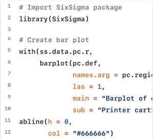
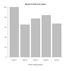
Bar Chart
The most straightforward and easy-to-understand sort of chart is the bar chart. Each bar in the graph indicates a different factor for measuring the variable of interest. Each bar’s height represents how frequently a particular number or metric occurs (e.g. defects, items, products). Regarding graphical representations of counts, bar charts are the most effective choice.
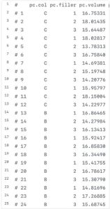
A specific chart will be generated using the ss. Data. Pc data set, a data set for a printer cartridge example included with the SixSigma package. This chart will be used for the example that follows.
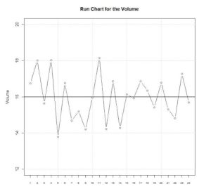
Run Chart
Run charts are two-dimensional charts in which the x-axis depicts a timeline and the y-axis plots a factor being supervised. Run charts are used to monitor the progress of a process. In run charts, the plotting of a centered line is the norm. This line can demonstrate a target value, the mean of the data, or any other value.
Whenever there is a time scale on the chart’s x-axis, this type of chart is sometimes referred to as a time-series chart. Run charts are helpful tools for identifying patterns within a process that may indicate upcoming changes (i.e. variability). Identifying cycles, trends, or shifts should serve as a catalyst for examining the process so that additional steps can be taken to improve quality.
Let’s have a look at the R code that will produce a run chart –
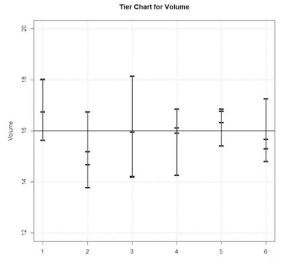
Tier Chart
If there is more than one observation associated with a run, tier charts are utilized. They assist in visualizing short-term variation as well as long-term variation in a single chart by combining the two types of variation. The variation that occurs inside each subgroup is a representation of the short-term variation. Still, the variation that occurs between all of the groups is a representation of the long-term variation.
When making a tier chart, perpendicular lines have been plotted at the role of each run from the highest to the lowest value. This creates the chart’s tiers. The single values are then shown as a point or a horizontal section, depending on the analysis performed.
Let’s have a glance at the R code that will produce a tier chart –
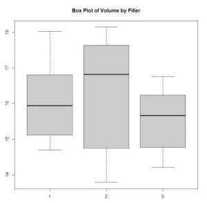
Box-Whisker Chart
The box-whisker chart is a type of plot that can be used to graphically form sum up the allocation of a continuous scale. It is also recognized as the box plot. The first & third quartiles are represented by the sides of the box (25th and 75th percentile, respectively). The contents of the box make up fifty percent of the total data. The line that cuts across the box represents the median and the extreme whisker principles, which can be the highest & minimum of data or other restrictions above which the data are recognized as outliers. The median is represented by the line that cuts across the box.
The following formula is typically used to determine the limits: Q1 & Q3 refer to the first and third quartiles, respectively, & IQR stands for the interquartile range (Q3 minus Q1).
If the distribution is centred or biased (i.e. the positioning of the median with regards to the entire data), when there are outliers (i.e. points outside the whiskers), or when the data are close to the centre values, the box plot can help you visualize this information (i.e. small whiskers or boxes). This chart is very helpful for comparing different groups and determining whether or not there are variations between the groups being compared.
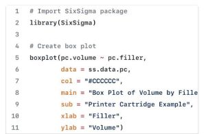
Let’s have a look at the R code that will build a box and whisker chart –
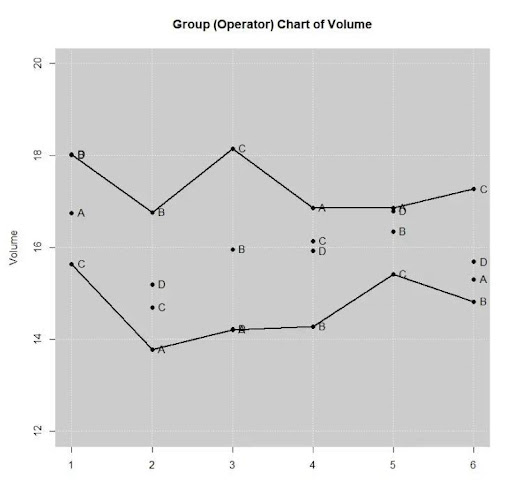
Group Chart
The primary purpose of group charts is to graphically display the category to which numerous points are assigned. In the context of Six Sigma, they are helpful when the characteristic being measured is generated by various processing streams or evaluated in different locations. In other words, they are useful in both of these scenarios. Lines often connect the values considered to be the maximum and minimum for each category.
Let’s have a glance at the R code that will produce a group chat –
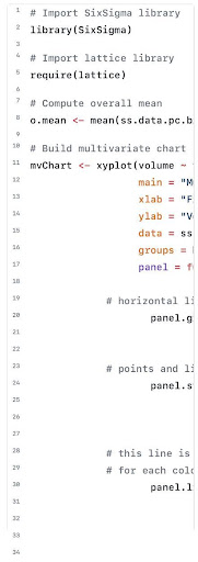
Multivariate Chart
The primary purpose of multivariate charts is to graphically determine the Critical To Quality features (CTQ), which refers to the elements that influence a certain outcome. As soon as the causes have been figured out, modifications can be suggested and implemented to reach the intended aim or goal.
An expanded form of the ss.data.pc.big data collection will be utilized to construct the multivariate chart that corresponds to the following illustration. The data set consists of 72 observations that correspond to all of the different potential combinations of the following four factors: colour (2), operator (3), filler (3), and batch (3). (4). Let’s have a glance at the R code that will produce a multivariate chart –
Concluding Thoughts
Engineers work on process improvement and quality assurance, & six Sigma has to be able to construct the most accurate charts possible to depict data by using the ideas described throughout this article. Similarly, cultivating and honing one’s skills in the graphical analysis will result in better interpretations (i.e., the easier detection of cycles, shifts, or trends), which in turn will help one produce more effective response plans to increase the quality of business deliverables.
The communication of the results, as well as the comprehension of the message that is being sent, will be made easier if the appropriate chart is chosen. This article’s goal is not to persuade readers to create these charts solely in R; rather, it is to demonstrate how to create them in free and open-source Business software, using only a few lines of code. This article doesn’t quite intend to convince readers to use R exclusively for developing these charts.